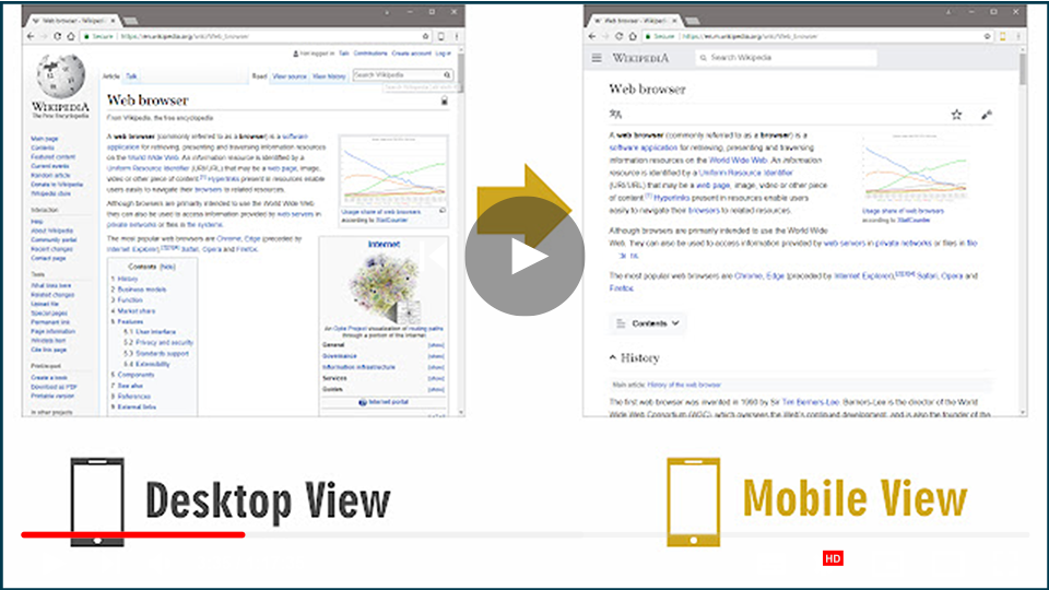

Switching to a mobile view on a desktop browser can be beneficial for web developers, designers, or anyone who wants to check how a website looks on mobile devices. Here are two effective methods to switch to mobile view effortlessly.
Method 1: Using an Extension (Mobile View Switcher)
The Mobile View Switcher extension is a simple and effective tool for quickly toggling between desktop and mobile views.
-
Install the Extension:
- Visit the Mobile View Switcher Extension page.
- Click on “Add to Chrome” (or the equivalent option for your browser) to install the extension.
-
Using the Extension:
- After installation, an icon will appear in your toolbar.
- Click on the Mobile View Switcher icon to toggle between desktop and mobile views. When active, the icon will turn yellow, indicating that mobile view is enabled.
-
Customizing User Agent:
- By default, the extension may switch to an iPhone view, but you can change this.
- Access the extension’s options page and enter a desired user-agent string for different mobile devices. You can find user-agent strings online.
- After making changes, simply reload any website to see the mobile view UI.
This extension makes it convenient to view websites as they would appear on mobile devices without needing to open developer tools.
Method 2: Using Developer Tools (Inspect Element)
If you prefer not to use an extension, most modern browsers have built-in developer tools that allow you to switch to mobile view.
-
Open the Website:
- Launch your preferred browser and navigate to the website you want to view in mobile mode.
-
Access Developer Tools:
- Right-click anywhere on the webpage and select “Inspect” or “Inspect Element.”
-
Enable Device Toolbar:
- Look for the toggle device toolbar icon (usually depicted as a mobile device or tablet) in the top left corner of the developer tools panel. Click on it to activate the mobile view.
- Alternatively, you can press
Ctrl + Shift + M(Windows) orCmd + Shift + M(Mac) as a shortcut.
-
Choose a Mobile Device:
- At the top of the viewport that appears, you can select different mobile devices from a dropdown menu. This will adjust the screen size and resolution accordingly.
-
Reload the Page:
- Once the mobile view is active, reload the webpage to see how it looks in the selected mobile layout.
Conclusion
Switching to a mobile view on a desktop browser is a straightforward process that can be accomplished using an extension or the built-in developer tools. These methods allow you to view websites in their mobile formats, ensuring a better understanding of user experience and design. Whether you choose to install the Mobile View Switcher extension or utilize the developer tools, you’ll find it easy to toggle between desktop and mobile views as needed.
By keeping these techniques in mind, you can efficiently check how your favorite sites or projects appear on mobile devices, making it easier to design or modify web pages for a mobile audience.